Justin Alexander unveils new corporate logo
American brand house Justin Alexander has decided to launch one company logo to unite its portfolio of collections.
During the process of updating of many of its collections over the last few months the company decided it was important to have a singular, powerful company logo to unite all its collections under one house.
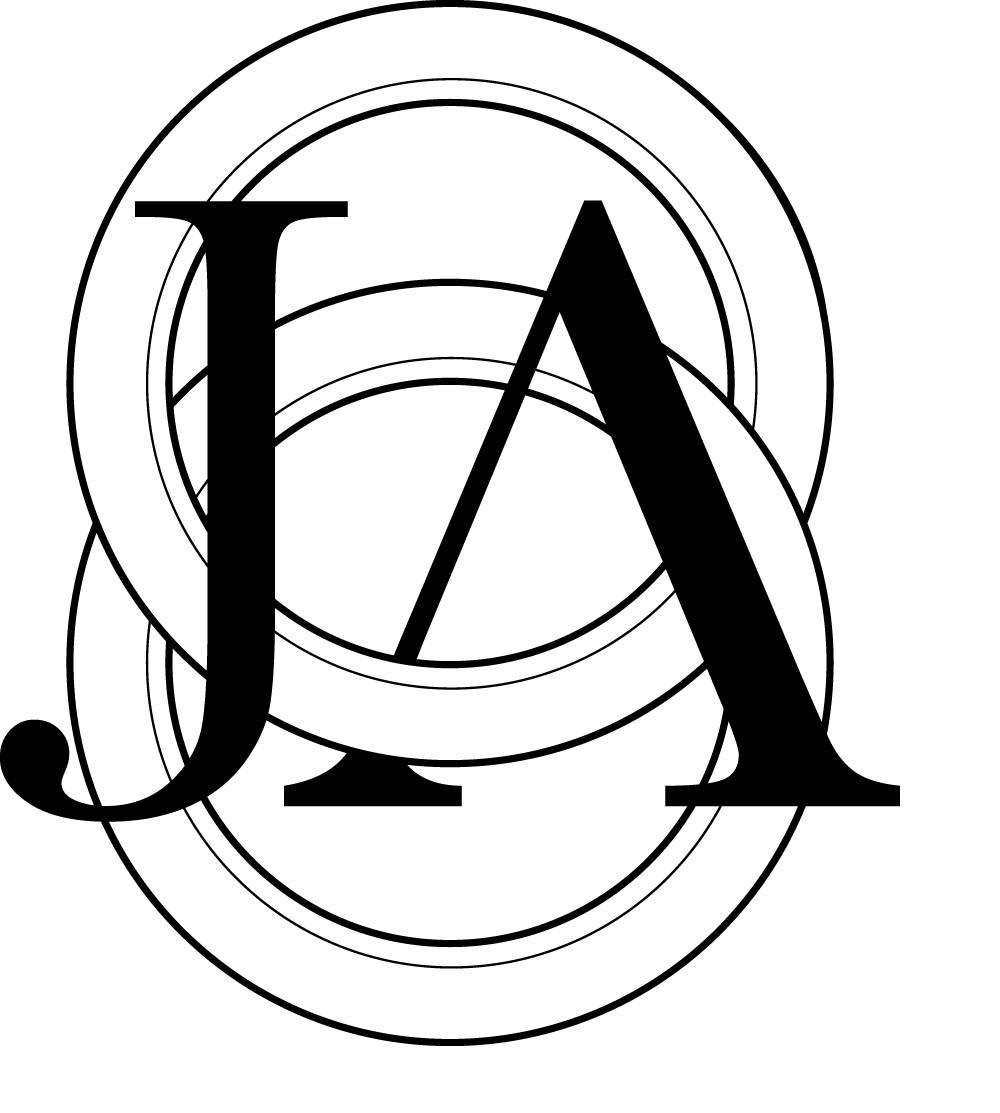
The new logo uses the already established JA monogram to reflect its commitment to tradition and heritage. Featuring interlocking rings and concentric circles, the design is reminiscent of the universal sign for infinity, evoking a sense of endurance in the industry.
The simple yet elegant logo consists of two individual rings, which stand as a symbol of matrimony and everlasting bond. Each ring is composed of three strokes as a nod to the three generations of the brand’s history.
Find further information on Justin Alexander and its portfolio of labels on our Brands Directory.


