Interior Design: Getting It Right
Our top tips on perfecting your boutique’s interior design, with specialist advice from design constancy, Design CLD.
Theme
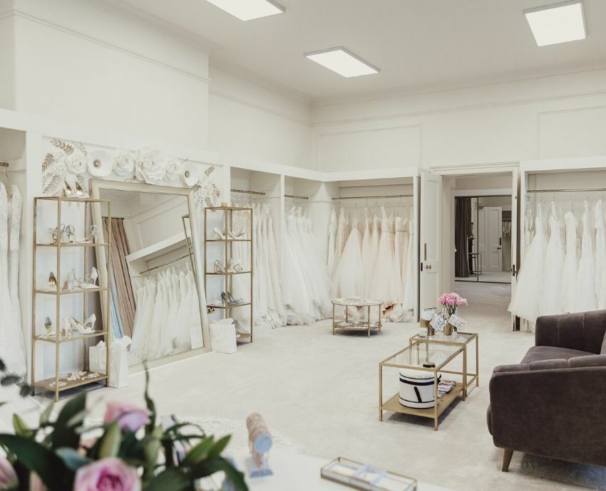
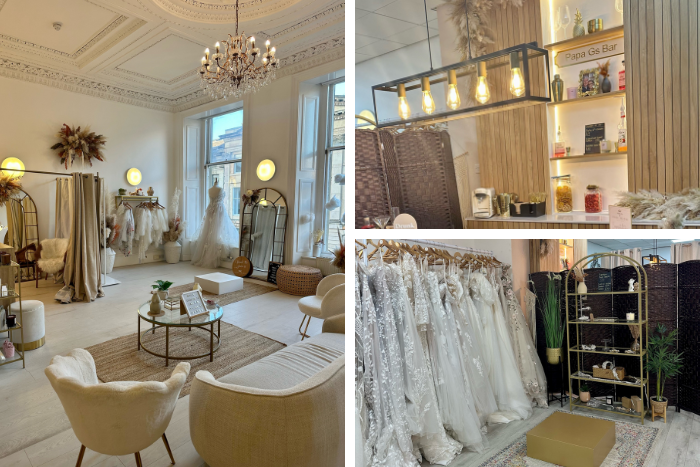
When designing the inside of your boutique, the first thing you need to choose is your theme. This should be unique enough to stand out, but at the same time should be suitable for your target audience. Interior design consultancy, ‘Design CLD’ have pinpointed four individual themes for your bridal boutique – romantic, natural, modern and classic.
If you are planning on decorating your boutique interior in a romantic style then think brilliant pinks, reds and purples complemented by rich golds and pure whites. Design CLD says, “Your fabrics must be full and lavish - use velvets, silks and lace for drapes, cushions and upholstery. Match this with gilded frames, with 17th and 18th century-style detailing in the furniture. When placed against luxuriant floorings such as marble or quality carpet, the finished product is a fairy-tale setting for the true romantic.”
If you decide on a more natural theme then Design CLD suggests to “use simple lines against pure textures and fabrics, together with a refreshing palette. Wood, ceramics, engineered timber and stone materials combined with beiges, peaches, greys and duck-egg hues create a natural look. It’s clean and simple but not dull or stale. Modern tweeds and wool on classic furniture also work well.”
For a more modern look, interior design features can be strong. “Reflection, shine and potent structural elements are key to this look,” says Design CLD. “The modern look features a directional design hand combined with a limited colour palette. To achieve this in a retail environment, use muted shades of chocolate, black, cement colours and beiges; counterpoint these with one or two bright colours. Useful textures are varnished brick, shiny laminates, glass and polished surfaces. Quirky designer furniture, prints, accessories and complementary lighting will complete the look,” they add.
The final theme that Design CLD talk about is the classic look. They add that “grace and stile are vital in this theme so make sure the colures in your boutique are feminine and charming. Shabby chic, reclaimed furniture and antiques against timber floorboards are ideal, and perhaps a feature wall with glazed wall tiles or floral wallpaper work well with this theme.”
Atmosphere
Once you have decided on the theme of your boutique, it’s time to set the right atmosphere. You want your bridal boutique to be a space where brides-to-be feel comfortable and relaxed. For smaller boutiques, creating an intimate, personal atmosphere is quite easy. For larger boutique, this can be a challenge. To avoid your boutique becoming cold and unfriendly opt for soft, warm lighting instead of fluorescent. You can also use spotlights to add focus to any dresses on display.
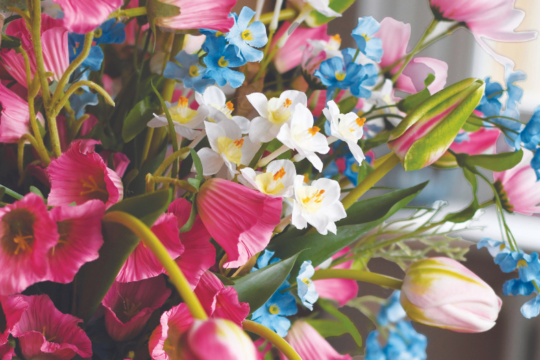
In addition to this, set floral displays (real or fake) throughout the shop. Place these displays on coffee tables, windowsills, at the checkout and finally beside the dressing rooms. Flowers will soften the look of your boutique, making it a more relaxed and inviting area.
Finally, if you have a lot of empty wall space in your bridal boutique a great way to overcome this is to fill them with candles, accessories, framed photographs of past brides or even mirrors set at different angles. Making the most of your empty space is a great way to highlight your offering and boast a little.
Layout
When designing the inside of your bridal boutique, it’s important that you get the layout right. You want your stock to be easily accessible by your customers and the simplest way of doing this is through a free-flowing spacing. This type of layout essentially means that there is no defined traffic pattern and customers are free to look through all of the wedding dresses you have in store at their own leisure.
To achieve this layout, opt for round racks that have been arranged around your shop floor. By doing so, you will avoid the blockages that straight aisles cause. In addition to this, round racks are easier to play around with, meaning you can present your stock in more enticing ways.
Focal Points
When decorating the inside of your boutique, it’s a good idea to have a few focal points. When a customer enters your store you want them to be immediately intrigued, and a focal point is a great way to achieve this.
One of the most common methods of creating a focal point in your retail display is using mannequins, as they will allow you to highlight the best of your offering. The most effective way to do this is to simply focus on the gown. Many retailers will style their mannequins flamboyant and edgy, but this can become a bit overwhelming which will in-hand ruin the effect entirely. Instead, let the gowns speak for themselves and present a selection of your finest designs.
Focal points have the ability to lead your customers to areas within your boutique where you want them to go. Therefore, avoid placing them by the sale racks and instead put them by some new gowns that you’ve recently got it.
Finally, remember to place all focal points at eye level so that they are easily visible to anyone entering your boutique. It’s a good idea to exit your shop and re-enter like a new customer to see if your focal points are evident when you first walk in.
For more advice like this, take a look at our top tips for creating an amazing window display.
